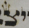
 Torah columns are fully justified – that is, the text extends tidily to each side of the column (see right). If you read the tikkun page, you’ll remember that there are various scribal techniques for achieving this effect.
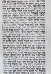
 The tidiest way to do it is by making letters and spaces ever so slightly bigger or smaller, so that the change in size isn’t even noticeable. However, sometimes that isn’t an option. The image at right is part of the Song of the Sea, where the text is constrained by a very specific layout (more on that some other time). There is simply no way to do this line subtly; one has to stretch. So, what can one stretch?
Some letters are obviously not stretchable. (For images of all the letters, you may refer to the Mishnat Soferim.) It’s fairly clear that one can’t stretch vav, for instance; it would turn into reish. So would khaf peshuta. Conversely, one can’t squash reish or khaf peshuta too much, because they’ll turn into vav.
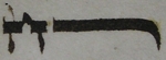
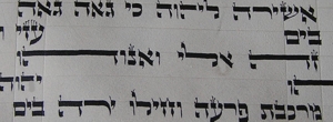
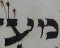
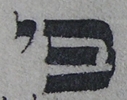
 >Indeed, this is one reason we don’t stretch things like zayin; we conceive of zayin as having a head approximately one-third the length of its height. If we thought of zayin as being essentially T-shaped, with the crucial feature being symmetrical extension of the head beyond the leg, we’d be able to extend zayin. But that’s not how we think of zayin, so we don’t extend it. Nun peshuta is similar, just longer, so we don’t extend nun peshuta either. Usually, that is. The image to the left shows a nun which has been desperately stretched; compare its head size to the head of the nun on the bottom line. It’s not invalid, but it’s not really an effect to aim for.
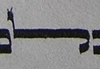
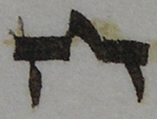 Het is conceived of being formed from two zayins, and as such, one may not extend het any more than one may extend zayin, either by making the zayins too long, or by putting them very far apart and making a very long peaked roof between them (since if one stretches a peaked roof too far it doesn’t really look peaked any more). The het shown is really pushing the limits of stretching.
 The image above also shows a stretched khaf and mem stuma. By convention, these aren’t deemed invalid if stretched, they just don’t look very nice if you stretch them too much. The weight of the horizontals is too much if you extend them in parallel too far. You see a similar effect if you extend beit (right).
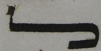
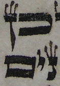
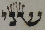
 The form of lamed is the subject of mild disagreement. Lamed is described as being more or less like a khaf with a vav on top. The question regarding stretching is: does the base part have to come forward as far as the top part, like a proper khaf? Or is it sufficient that it be bent round behind? If the former, stretching it would be like stretching khaf – rather uncomfortably heavy. If the latter, stretching lamed would be more like stretching reish. The lameds pictured (left and right) are tending towards the latter opinion, keeping enough of a base that they don’t look completely unbalanced.
 So far this page has looked at extending horizontals and double horizontals, which is by far the easiest way to stretch a letter. One can, theoretically, stretch out diagonal strokes, but it really looks awfully weird. For some reason alef is often stretched – perhaps because it has a reasonably thick diagonal, so it doesn’t mess with the black/white balance too much. It still looks rather odd, but not as odd as tzaddi, or ayin, or shin, or peh.
It’s basically nicer not to stretch letters; one wants one’s script to be uniform and nice to look at. Sometimes one has to stretch letters, sometimes even through no fault of one’s own, but there is such a thing as taking it too far.